PBfit® Peanut Butter Powder
brand identity // packaging // photography // video
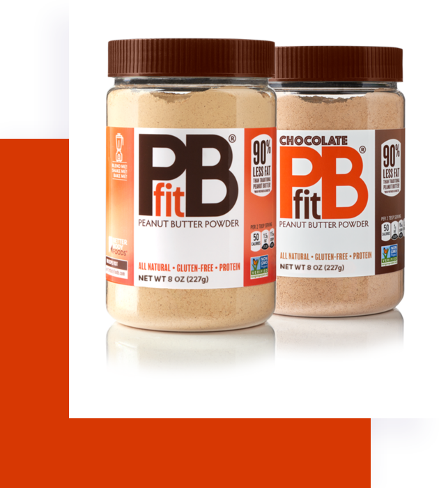
It’s not an exaggeration to say that people go nuts for PBfit®. The wonder product has one-third the calories and 90% less fat than regular peanut butter and tastes a little bit like heaven. Needless to say, we were pretty pumped to be able to guide the PBfit® rebranding effort. Taking a beloved product and giving it a facelift and repositioning was a delicious challenge and we were up to the task!
Looking the Part
PBfit® was no longer the new kid on the block. The versatile, flavor-packed product had developed a cult following and was capturing a significant share of the market but the visual identity of the brand was falling short. We jumped at the chance to get involved with refining the brand position.
Identifying the brand promise and personality enabled us to clearly design a bold and clean look for the line. Packaging, apparel and web platforms all don the new look and the customer response was overwhelmingly positive.
Opposites Attract
The idea that healthy and tasty truly CAN coexist was the premise for this PBfit® spot that aired during Super Bowl 51. Collaborating with the geniuses at Issimo was a beautiful exercise in crafting messages that stay true a brand’s WHY. We’re pretty sure something in this spot will bring a smile to your peanut butter-covered face.
Got a branding project?
We'd love to hear about your brand needs or struggles and help you set some goals. Tell us a little about what you've got going on and we'll get in touch to see where we can go from there.
Email us at:
[email protected]


